


The history of the WTA: from independence to innovation – rebranding and the evolution of the tournament system


Since its inception in 1973, the Women's Tennis Association (WTA) has been a pioneer in women's professional sports, and its development has not only witnessed the professionalization of women's tennis, but also reflected the continuous innovation of its brand image and tournament system. From battling the men's professional tennis team (ATP) to the tournament level adjustments and logo design controversies in recent years, every step of the WTA has carried with it the pursuit of equality, innovation and globalization.

In 1973, under the initiative of 63 players including Billie Jean King, the WTA was officially established, with the full name of Women's Tennis Association in English, aiming to strive for equal opportunities and prize money for female players. At that time, women's tennis tournaments had only $1.9 million in prize money spread across 10 countries, while men's tennis tournaments had formed a more mature professional system. The establishment of the WTA marked the official departure of women's tennis from the dependence on men's competitions and the opening of the road to independent development.

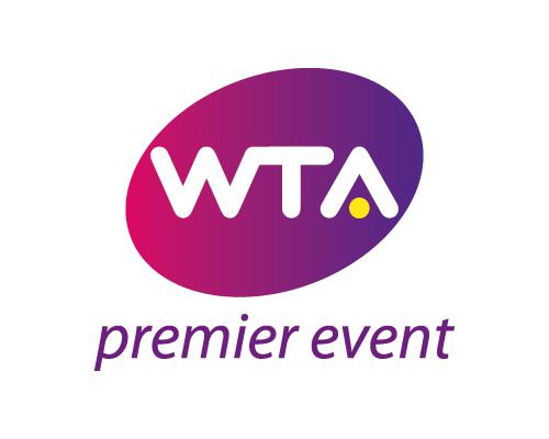
In the early days, the WTA logo design had not yet formed a unified style, and most of them were dominated by the logo of the tournament sponsor. It wasn't until 2010 that WTA debuted a modern brand logo, with a bold "WTA" monogram and a yellow dot on the horizontal side of the letter "A" to symbolize tennis, abandoning the traditional silhouette of athletes. The change was designed to highlight the combination of "globalization and entertainment", which Allast, then president of the WTA, called "a symbol of the convergence of sports and entertainment".
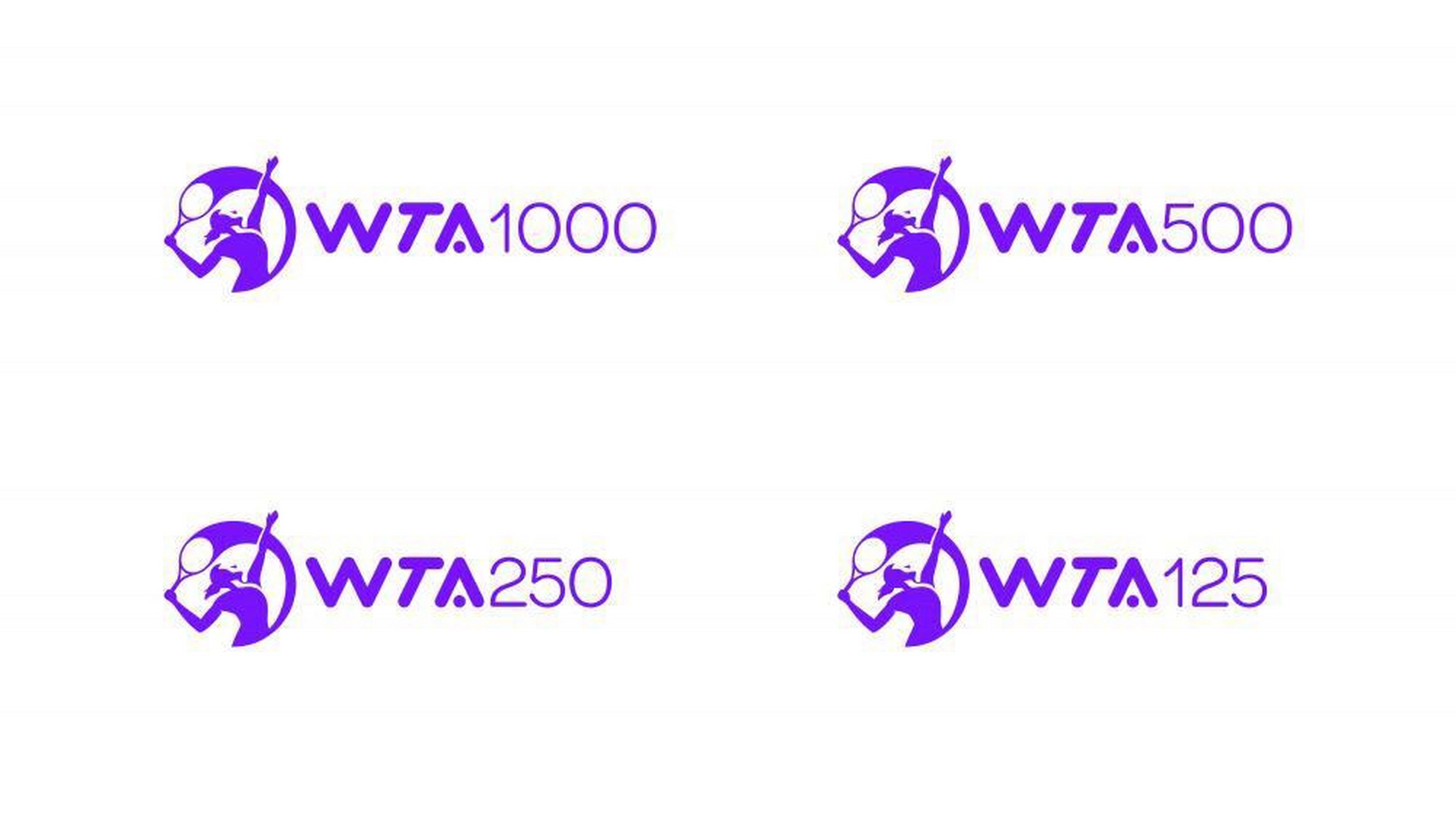
The WTA's tournament system has undergone a number of changes, one of the most notable of which was the reclassification of tournament levels in the early 2020s. Previously, the WTA Tour was divided into categories such as the Crown, Super Five and International. In order to simplify the system and enhance brand unity, WTA merged the original crown tournament and super five tournaments, collectively known as the "WTA1000" level, and benchmarked with the "ATP1000" of international men's tennis, forming a four-level competition structure of 250, 500, 1000 and year-end finals. This adjustment not only strengthens the brand identity of the event, but also increases the size of the prize money. For example, the 2024 WTA season will have a record total prize money of $221 million, and the year-end finals singles champion will receive a whopping $4.8 million in prize money. Event-level consolidation has also led to a global presence, with Shenzhen, China, hosting the WTA Finals since 2019, further consolidating its position in the Asian market. Although Shenzhen was only held for one year due to the epidemic and financial problems, the subsequent year-end year-end hosting venues were rotated around the world, which also proved the life and vitality of the WTA.
The design of the WTA logo has undergone several iterations, and each adjustment reflects the changing background and strategic direction of the times: the logo released in 2010 has a simple letter design at its core, weakening the image of athletes and emphasizing the internationalization of the brand. Designer Tom Geismar explains that the aim is to "break the traditional symbols of professional sports" and convey a sense of power through bold lettering. However, the design was controversial due to its lack of tennis elements, with some fans believing it to be too abstract. In 2020, the WTA updated its logo again, reintroducing the silhouette of female athletes swinging the racket and placing it in a circular frame to symbolize "globalization and unity". Designer Landor Australia says the changes are a tribute to the fighting spirit of the WTA's founder, while reinforcing the sporting nature. The return of the silhouette is seen as a reinterpretation of traditional elements, which has been widely recognized by players and fans alike. In 2025, the WTA unveiled a new brand identity, "Rally the World", which once again removed the athlete's silhouette in favor of a green and white minimalist lettering design with a font ligature, which was heavily criticized by players: France's Mladenovic bluntly said that the new logo was "devoid of tennis", and Britain's Tara Moore questioned the justification of its six-figure design cost. Behind the controversy, the WTA's disconnect between brand positioning and player demands has been exposed.

WTA's rebranding has always sought a balance between "innovation" and "tradition". The 2025 logo controversy highlights the dilemma of professional sports organizations: on the one hand, brands need to attract young audiences through visual innovation and adapt to the trend of digital communication; On the other hand, athletes and core fans value the logo as an interpretation of the essence of the sport. For example, the 2020 logo was widely praised for its historical and global appeals, while the radical design of 2025 was questioned for ignoring the symbol of movement. In addition, the WTA's commercialization process needs to be coordinated with athlete rights, and while the WTA joint venture has achieved a 25% increase in revenue through broadcast partnerships, player criticism of resource allocation reflects the need for organisations to focus more on balance "on and off the field".

The history of the WTA is essentially a microcosm of the shackles that have broken through women's sports. From independence from the ATP to the innovation of the tournament system, from the repeated adjustment of the logo design to the expansion of the commercial territory, the WTA has always explored how to better convey the "power of women" and "sportsmanship". In the future, how to integrate traditional symbols and modern aesthetics in the brand image, and how to find the fulcrum between commercialization and athletes' well-being, will be the key to the sustainable development of the WTA. As WTA CEO Achill said, "Our brand is not just a logo, it's a stage to tell the story of women's struggles." "No matter how the logo changes, the WTA's core mission – to create equal opportunities for female athletes – remains its deepest spiritual totem.(Source: Tennis Home Author: Xiaodi)

 Links
Links
 Contact
Address:UNIT 1804 SOUTH BANK TOWER, 55 UPPER GROUND,LONDON ENGLAND SE1 9E
Number:+85259695367
E-mali:[email protected]
 App
App