


From being strong and beautiful to playing against the world: the change and immutability of the WTA is like a group portrait of women


"On February 27, the WTA is going to have a big news." The big news is that the WTA's brand identity has been renewed.
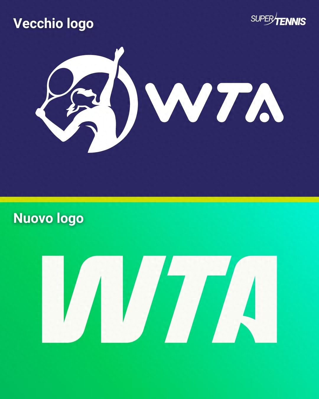
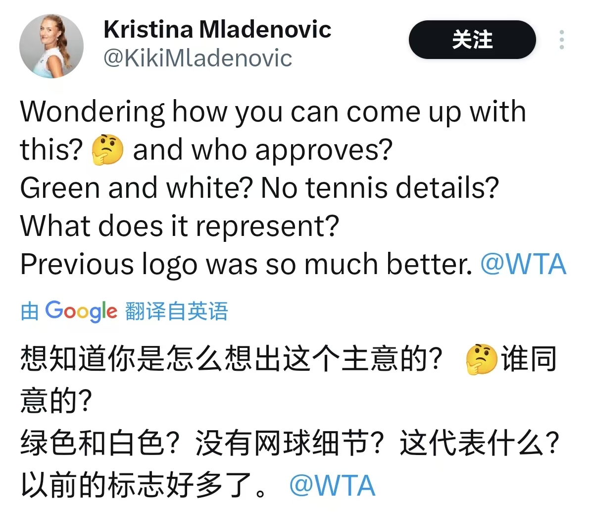
The WTA has made a bold change to its logo, ditching the purple theme that has been used for decades and replacing it with green as the base color. Netizens said "it's not good-looking" and "I prefer the previous version", and Mladenovic said directly: Who came up with this? There is no tennis element.
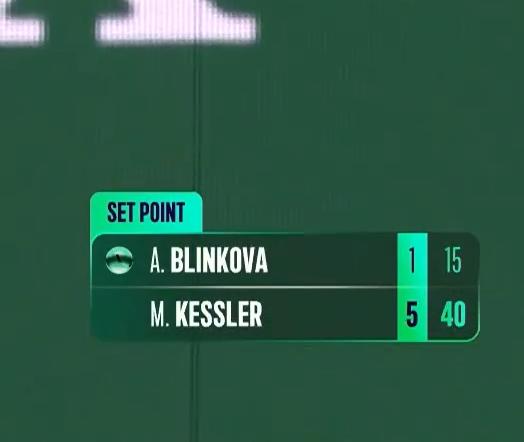
At present, the overall official website of the WTA is still purple, but the live score logo uses green, which is very eye-catching against the background of purple.
Indian Wells is the first tournament after the WTA rebranded its logo. As part of the brand's visual design, the WTA Tour's broadcast design was tweaked accordingly, with green and transparent elements added to the scoreboard and statistics. Netizens complained that the new scoreboard was unclear, looked strenuous, and looked like a computer game, and it seems that fans still prefer the previous color scheme and design, or it can be said that they are "more accustomed" to the original design.
It has been pointed out that although the WTA has made formal updates, the functional interface has not changed in fact. Indeed, compared to the ATP next door, the WTA ranking page still can't filter dates and countries at the same time, and the user experience is a big difference.
In addition, the WTA filmed a set of "WTA Rally the WorldPropaganda photo for the slogan. Ally is a polysemous word, it means "round" in tennis, for example, when we look at the game, we will see "longest rallies", and it also means to gather, gather. The WTA's slogan is a pun: borrowing the concept of alternating between the two sides of the net in a tennis round, and calling for everyoneBreak boundaries。

As WTA CEO Archer said, "We invite fans from all over the world to join us in Rally the World and push boundaries even more." "While there are mixed reviews of the rebranding and the audience taking some time to get used to the new interface design, the WTA's new logo has become more concise and conveys the ambition to be future-oriented, break down boundaries and cross boundaries.
Every innovation is accompanied by a round of reminiscences of the past.
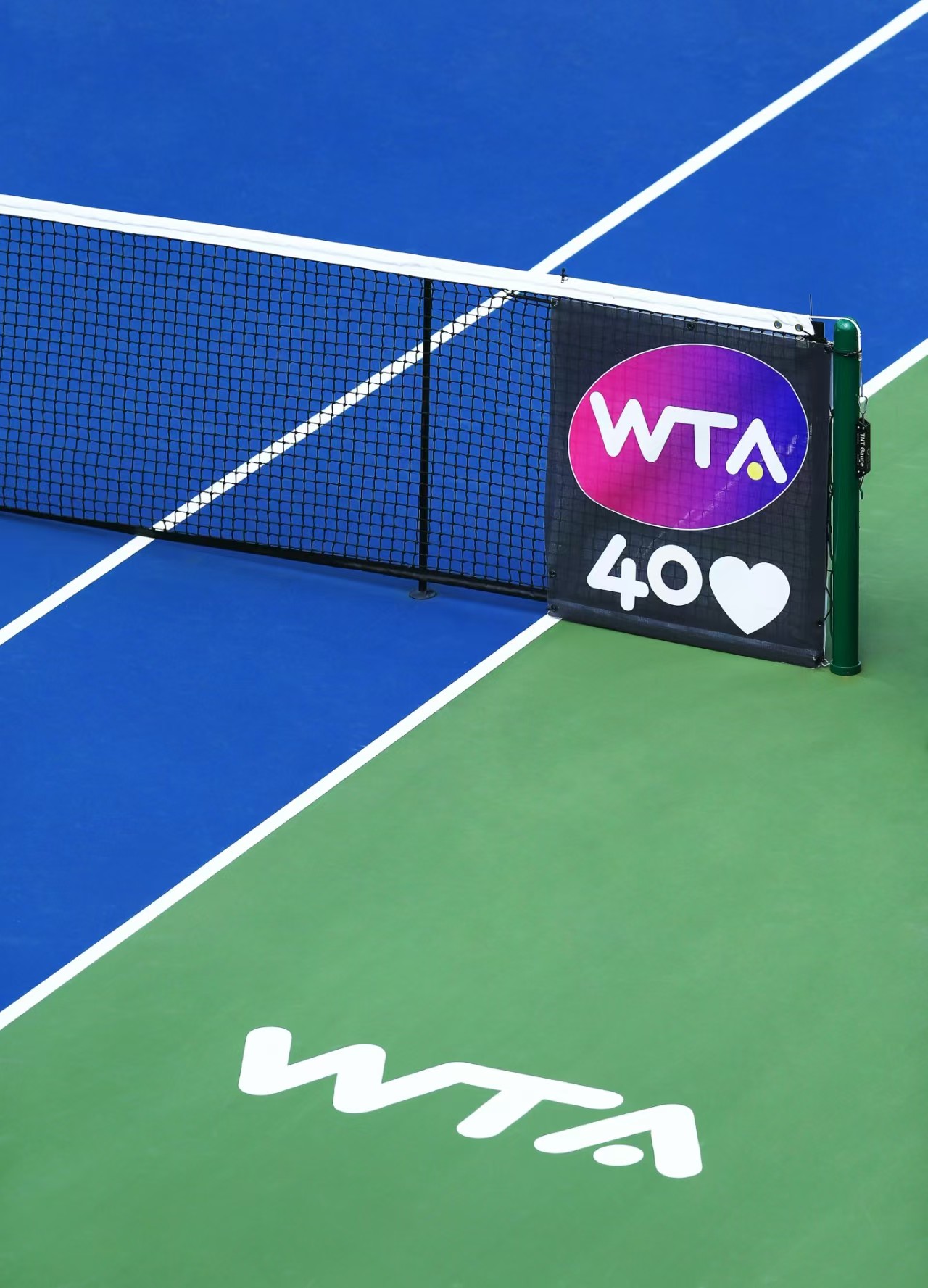
The WTA has released a brand update that reminds fans of women's tennis that it was a pun on the 40th anniversary of the WTA: Forty love. Love stands for zero in the scoring of tennis matches, which originally originated from the French language, where tennis was born.Forty love is both an expression of love that has lasted for forty years, and a clarion call for the WTA to start again after forty years.It's like a match point call, just two words, concise and powerful, loud and full of tennis characteristics. It's a classic of the WTA's use of puns.
Founded in 1973, WTA celebrated her 40th birthday in 2013 during the golden age of women's tennis. Serena Williams, Sava, Li Na, Azarenka, Radwanska, Kvitova...... These names shine eternally in the starry sky of women's tennis.
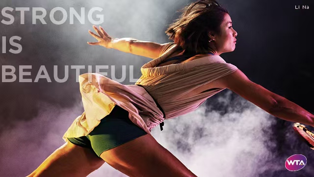
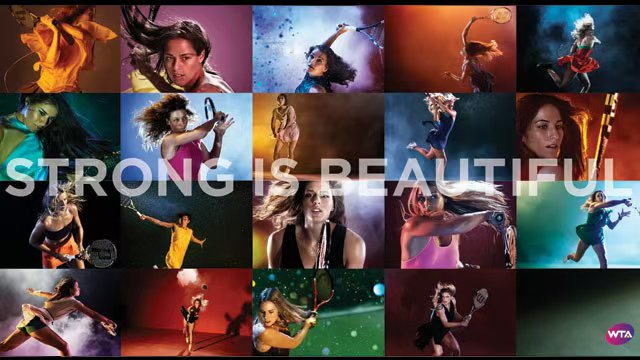
The 2010s were also a period for WTA Aesthetic Online, which launched its slogan "Strong is beautiful"And the blockbuster shot is stunning. The colours of the colour seem to come from another time and space against the backlight, and the female athletes who hit the ball in slow motion are dressed in more fashionable tennis skirts – even though tennis is already one of the most fashion-connected sports, with the flowing, light, wind-blowing hem of the shirt and the muscles full of strength. The WTA blockbuster showcased the perfect combination of strength and beauty in female athletes, with the titles strong and beautiful – a group portrait of female tennis players of this era.
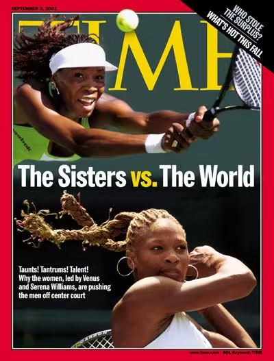
It was an unrepeatable time.Selena Williams won her 23rd Grand Slam singles title while pregnant, leaving history written by Graff. The story of Williams's struggle against the world's preconceptions was printed on the cover of Time under the title "The Sisters vs. The World."

That was a time that would never go back.Maria Sharapova stepped into Arthur Ashe Court in a black tennis skirt, and the Swarovski crystals on the skirt reflected a long time ago, echoing from the evening breeze in Flushing 2006.

It was a time when I remember it with great emotion.As Schiavone's return ball grew out of the baseline, Li Na lay down in the center of the stage at Roland Garros. "Il ne faut pas reculer, il faut avancer" (You can't go back, you can only go forward).come from2011The red clay of early summer never fades, and the glory of Susan Lenglen is complemented by the five-star red flag。

At that time, women's tennis repeatedly broke the circle and gained attention far beyond the project itself, thanks to a group of players with great personality and vivid faces, who boldly opened the microphone and bravely stood in front of the world to express themselves and pass on values.Together, we can make the sport a better place and make the world a little bit better。
Today's WTA lacks dominant players, but it has a bit more of a competitive edge. Tennis and fashion are more closely combined, players have a wider range of interests, tennis is a part of life, but not all, and players who travel to participate in the competition by enriching their off-court life, for the daily life of the journey to depict a few bright strokes.

Time passes, stars change, and the charm of women's tennis is still the same, femaleSincere, straightforward, wise and courageousandstrongPresented to the world through the sport of tennis. In 1973, Billie Jean King and her generation of female tennis players sought change in their defense of rights and equality, and their actions and spirit continue to live on to this day.(Source: Tennis Home Author: Yuyu)

 Links
Links
 Contact
Address:UNIT 1804 SOUTH BANK TOWER, 55 UPPER GROUND,LONDON ENGLAND SE1 9E
Number:+85259695367
E-mali:[email protected]
 App
App